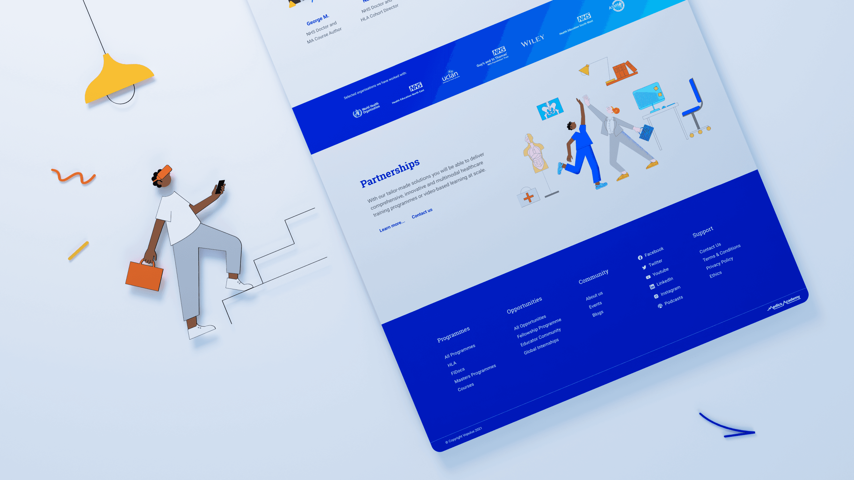
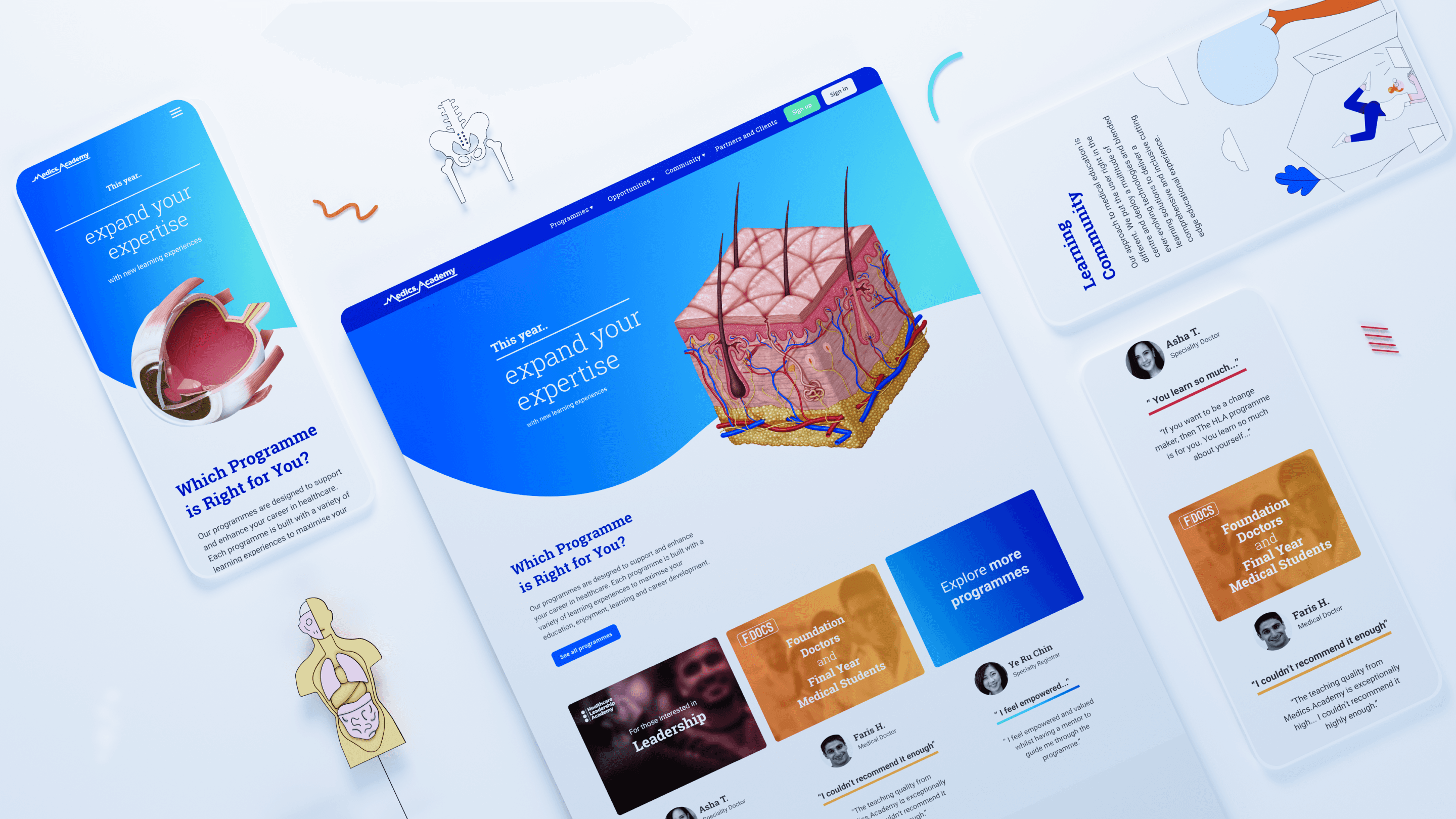
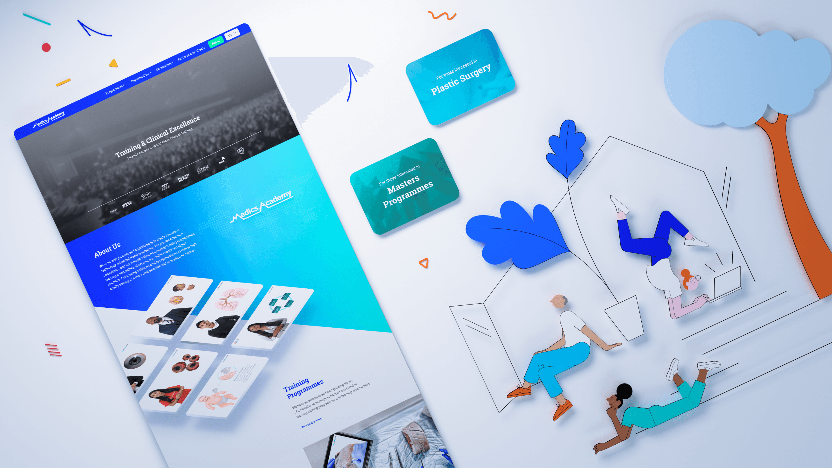
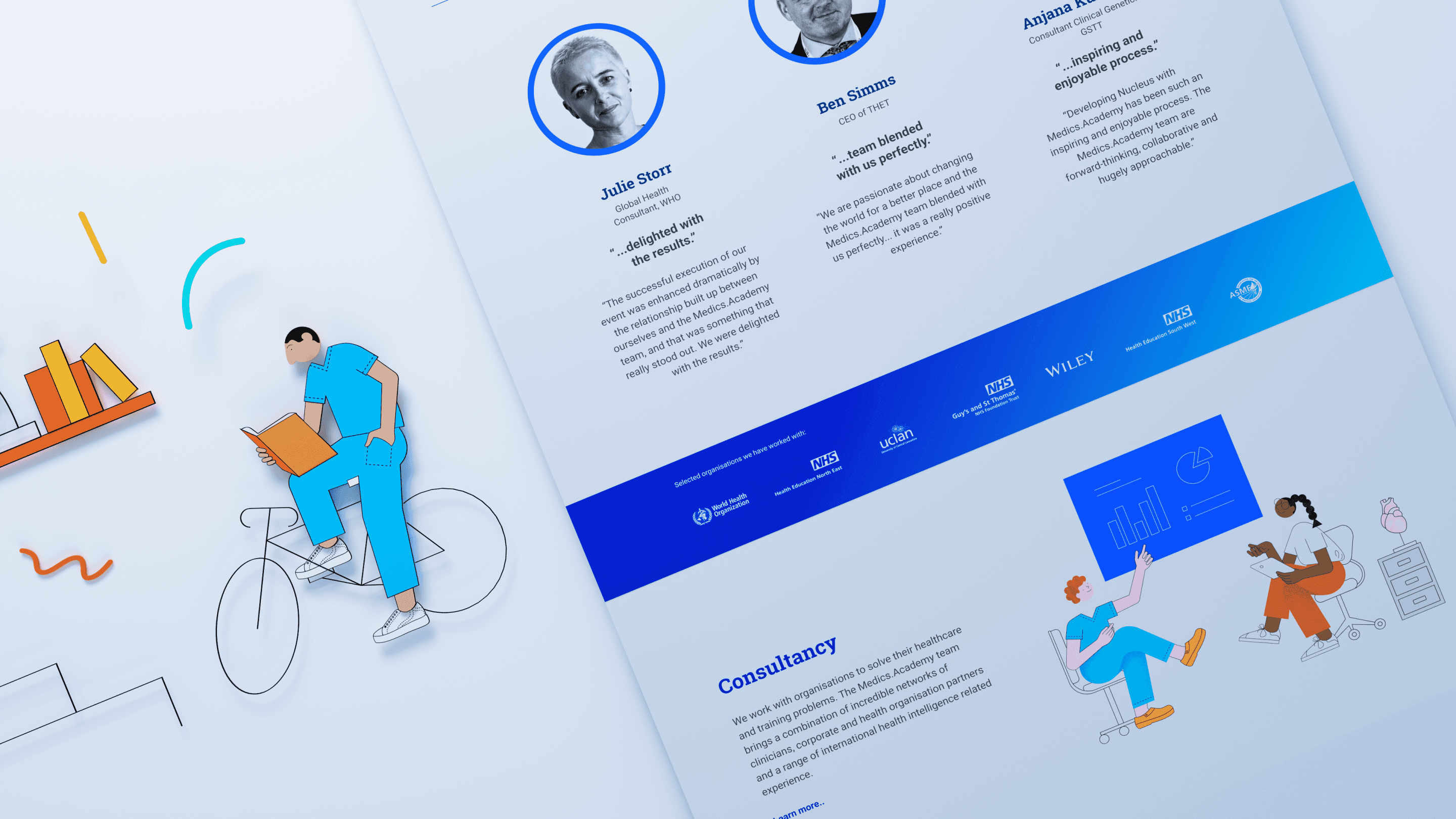
As lead designer, I directed the Medics Academy platform front-end redesign. As the company matured and entered new stages of growth, the platform needed to evolve to reflect this, while also addressing accumulated design debt. I ensured seamless Thinkific LMS integration while focusing on improving user experience, brand consistency, and supporting the company’s expansion.
Impact
increase in sign-ups during the first month following launch.
Client
Medics Academy
Industry
Medical Education
Category
UI/UX • Art Direction
Year
2023
My Role
Design Lead
I led the redesign from discovery through to delivery, defining the design vision, user experience, visual direction, and information architecture.
Responsibilities
End-to-end design
Leading the full design process from discovery to final delivery.
UX strategy
Planning research, defining information architecture, user flows, concepts, wireframes, and prototypes.
Visual direction
Establishing the visual direction and directing illustration exploration.
Alignment
Maintaining consistency across landing pages, brand, content, stakeholders, and UX.


Context
The company’s evolution over several years led to a diverse range of products and offerings, which inadvertently resulted in significant design debt. These incremental updates lacked cohesion, preventing the various elements from functioning as a unified system. Consequently, a comprehensive overhaul of the platform’s front end was initiated to resolve these inconsistencies. This strategic redesign not only synchronised the platform with the current growth trajectory of Medics Academy but also provided a robust, scalable framework to support the development of future services and products.
Medicine and warmth
How might we balance the seriousness of medicine with an engaging and approachable learning experience?
One ecosystem
How can multiple products and sub-brands be unified under one coherent ecosystem?
Distinct imagery
How do we communicate visually while reducing reliance on generic stock photography?
Consistency
How can we establish consistency across language, user experience, and interface design?
Insights
To inform the redesign, I employed a comprehensive range of research methodologies. This process began with extensive desk research and a thorough analysis of the competitive landscape. I also engaged directly with our user base and consulted relevant academic studies to ensure a data-driven approach.
01
Users struggled to identify the most relevant learning opportunities.
02
Age, speciality, digital literacy, and background varied significantly.
03
Medically inaccurate stock photography reduced perceived credibility.
04
The platform did not fully communicate the collaborative nature of healthcare learning.
05
Inconsistent terminology, navigation, and branding weakened users’ mental model.
design strategy
Redesign
This project was a comprehensive, ecosystem-wide redesign that united numerous stakeholders across the organisation. To manage the complexity, we segmented teams to work concurrently on distinct layers of the platform, ensuring alignment while maintaining a unified strategic vision.
Information Architecture
Restructured content and navigation to clarify the relationships between programmes, products, and services.
UI & UX Consistency
Standardised interaction patterns and visual language to reduce cognitive load and improve usability.
Language Consistency
Introduced clearer language and a unified tone across product, marketing, and educational content.
User Flows
Reworked key journeys to remove friction and guide users more directly toward learning and purchase.
Naming Conventions
Established a consistent system for naming programmes and products so users always know what they’re looking at.
Marketing Messaging
Aligned the marketing voice with the in-product experience, so the promise and the platform tell the same story.
Visual Identity
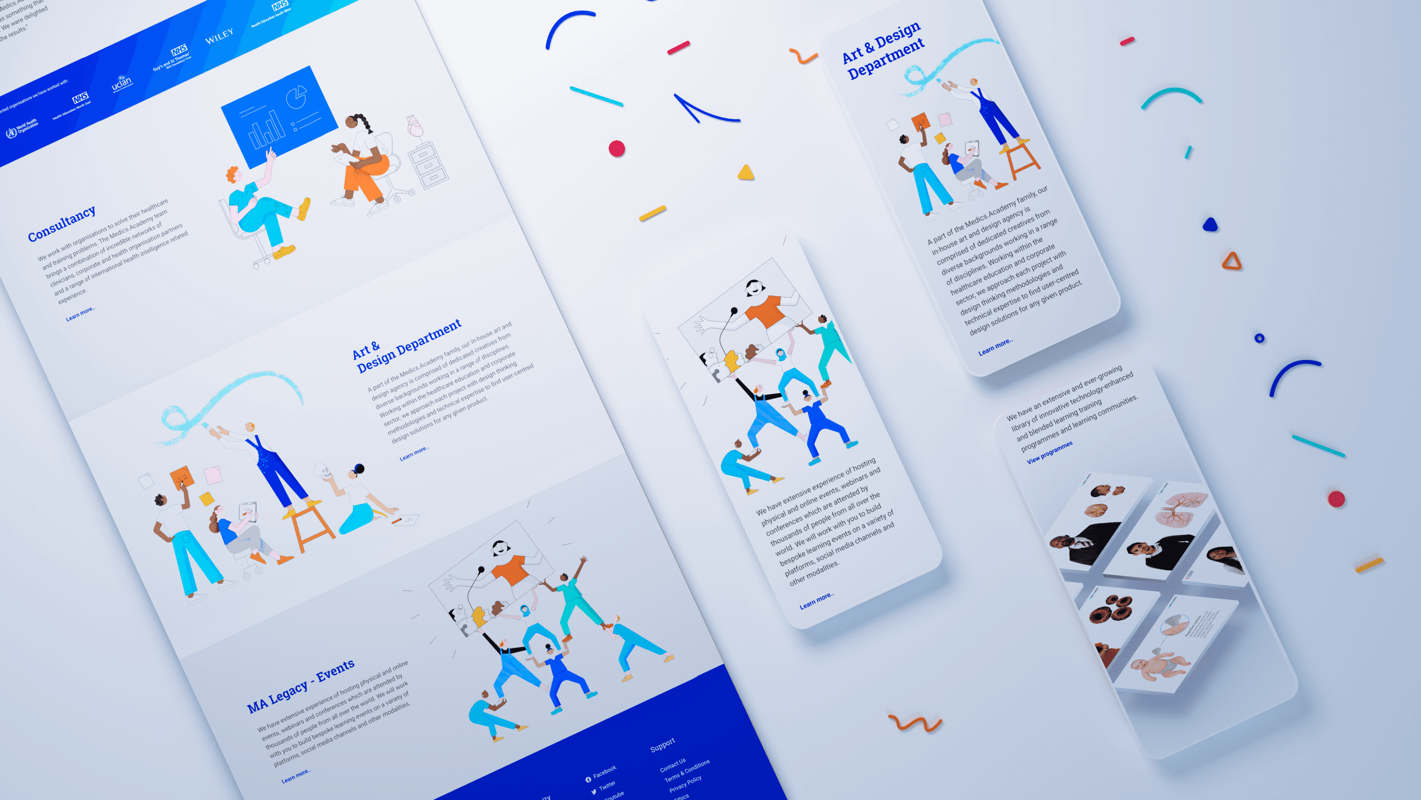
Built a distinctive illustration system and colour language that sets the platform apart from generic healthcare imagery.
Outcome
175% increase in sign-ups during the first month after deployment.
“The new Medics Academy platform feels like a breath of fresh air compared to the old one. The new visuals and improved navigation are brilliant.”
— Josh P., Foundation Doctor
Reflection
This project demonstrated that successful healthcare design extends far beyond aesthetics. By combining research, information architecture, visual design, content strategy, and stakeholder collaboration, we transformed Medics Academy into a more intuitive, trustworthy, and engaging educational experience for healthcare professionals worldwide.