CASE STUDY / MEDICAL EDUCATION
Medics Academy Platform Redesign
A platform redesign for a London-based medical education company, created to improve usability, establish a cohesive brand experience, and support continued organisational growth.
Impact
175%
increase in sign-ups during the first month following launch.
Client
Medics Academy
Industry
Medical Education
Category
UI/UX • Product • Art Direction
Year
2023

My Role
Design Lead
I led the redesign from discovery through to delivery, defining the design vision, user experience strategy, visual direction, and product architecture. Design served as the primary framework for decision-making across strategic, product, content, and visual decisions.
Responsibilities
Leading the end-to-end design process
Planning and facilitating research activities
Defining UX strategy, information architecture, and user flows
Establishing visual direction and directing illustration exploration
Creating concepts, wireframes, prototypes, and final designs
Aligning stakeholders and maintaining consistency across product, brand, content, and UX
Design Leadership
Matt Gidaszewski — Design Lead, UX Strategy, Product Design & Art Direction
Programme Delivery
Dr Emma Cox — Programme & Stakeholder Management
Illustration Team
Elle Lever, Charlie Dixon, and Tiziana Ruiu — Medical Illustration
Background
Design debt had accumulated as the platform expanded.
Navigation had become increasingly complex, branding across products lacked consistency, and users struggled to understand the breadth of learning opportunities available. The redesign aligned the platform with Medics Academy’s growth while establishing a more scalable foundation for future products and services.
How might we balance the seriousness of medicine with an engaging and approachable learning experience?
How can multiple products and sub-brands be unified under one coherent ecosystem?
How do we communicate visually while reducing reliance on generic stock photography?
How can we establish consistency across language, user experience, and interface design?
Research & Discovery
We studied how healthcare professionals perceived Medics Academy, how they navigated the existing platform, and what visual approaches felt credible, professional, and approachable in a medical education context.
User Interviews
Medical students, foundation doctors, consultants, midwives, and allied healthcare professionals shared learning behaviours, trust signals, platform challenges, and expectations around credibility.
Visual Exploration
Participants assessed multiple illustration styles for professionalism, friendliness, expertise, and trustworthiness. The preferred direction balanced clinical accuracy with approachability.

Key Research Insights
Recurring themes shaped the platform direction.
Clarity & Navigation
Users struggled to identify the most relevant learning opportunities.
Audience Diversity
Age, speciality, digital literacy, and background varied significantly.
Trust & Credibility
Medically inaccurate stock photography reduced perceived credibility.
Community & Belonging
The platform did not fully communicate the collaborative nature of healthcare learning.
Consistency
Inconsistent terminology, navigation, and branding weakened users’ mental model.
Yasmin
19-year-old medical student in London looking for engaging educational experiences that fit around her studies.
Umar
40-year-old Consultant Gastroenterologist interested in professional development and knowledge sharing.
Elijah
25-year-old Foundation Doctor seeking accessible learning that supports career progression.
Emily
32-year-old Midwife balancing ongoing education with a busy working life and personal commitments.
Design Strategy
A full ecosystem redesign, not just an interface refresh.
The work addressed user flows, information architecture, copy, naming conventions, marketing messaging, visual identity, UI consistency, UX consistency, and language consistency across the platform.
Information Architecture
Restructured content and navigation to clarify relationships between programmes, products, and services.
UI & UX Consistency
Standardised interaction patterns and visual language to reduce cognitive load and improve usability.
Language Consistency
Introduced clearer language and a unified tone across product, marketing, and educational content.
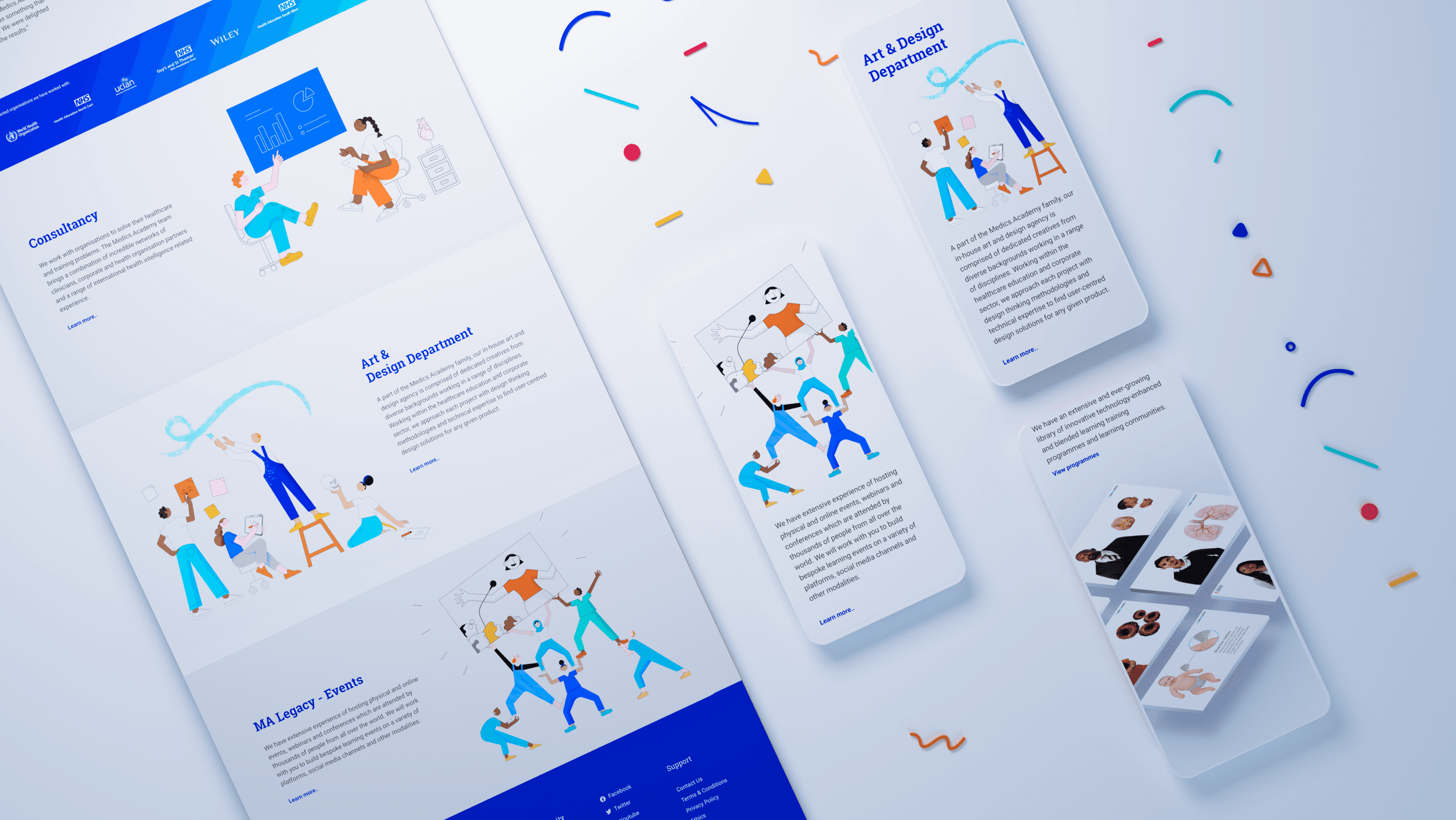
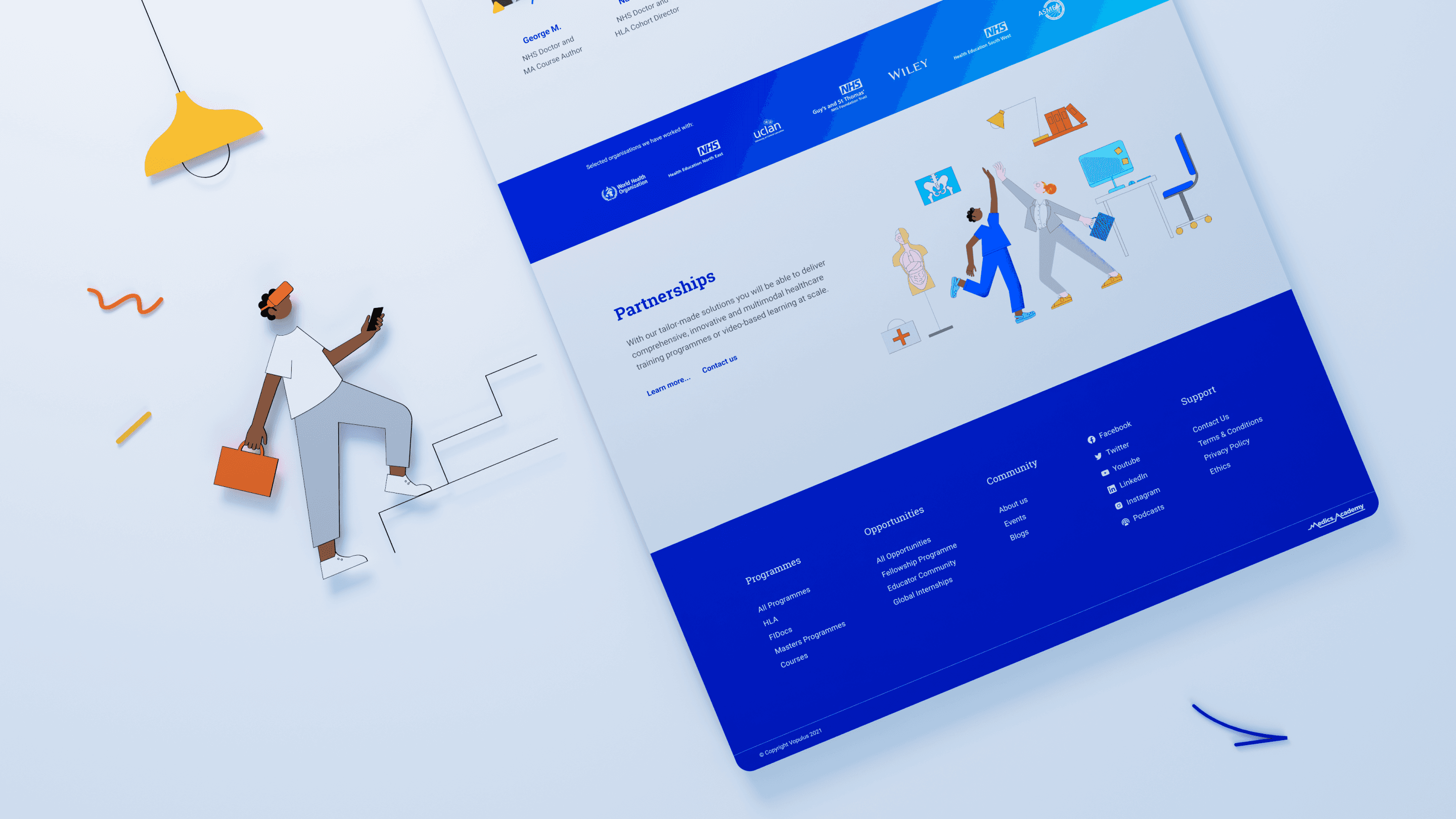
A distinctive visual language built around medical illustration.
Rather than relying on generic healthcare imagery, the redesign introduced custom medical illustrations, anatomically accurate educational visuals, vibrant colour systems, modern typography, clear hierarchy, and accessible layouts focused on readability.

Solution
The redesigned platform delivered clearer navigation, stronger product hierarchy, improved onboarding journeys, more consistent branding, enhanced accessibility, increased trust through medically accurate visuals, and better communication of educational pathways.
Outcome
175% increase in sign-ups during the first month after deployment.
“The new Medics Academy platform feels like a breath of fresh air compared to the old one. The new visuals and improved navigation are brilliant.”
— Josh P., Foundation Doctor
Reflection
This project demonstrated that successful healthcare design extends far beyond aesthetics. By combining research, information architecture, visual design, content strategy, and stakeholder collaboration, we transformed Medics Academy into a more intuitive, trustworthy, and engaging educational experience for healthcare professionals worldwide.